Daily Investment Report
Role
End-to-end Product Designer & Creative Lead
Stakeholders
2 Product Managers, 8 Engineers, 1 UX Writer, 1 Researcher & 1 Analyst
Tools
Figma, Photoshop, After Effects & Illustrator, Lottie
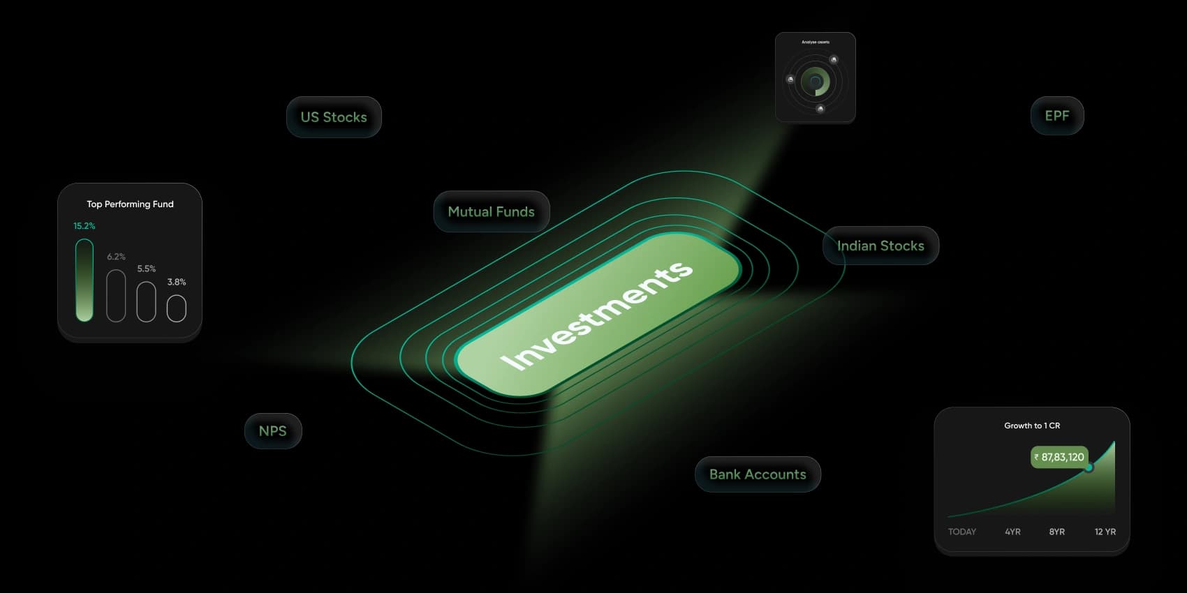
5x engagement with retention surfaces. +15% click-through on investment actions. More daily app opens via push. Users cited 'clarity' and 'quick glance' as standout qualities.
A daily investment report that shows users exactly how their money moved — across mutual funds, stocks, EPF, NPS, US Stocks, and more — in one interactive view. Built to simplify performance, add market context, and turn passive checking into active decision-making. Storytelling, motion, behavioural nudges, and smart summaries all woven in.
Problem
People feel disconnected from their investments — overwhelmed by charts with no context. "I never know if my performance is good or if it's just the market going up."
Solution
- — 360° daily summary card with return delta and invested value toggle
- — "You vs Market" dual-bar comparison with Nifty50 to make performance meaningful
- — Curated market news carousel for real-world context
Problem
Users had no clear next step. Generic advice was easy to ignore. "I want someone to tell me what to check and be updated on."
Solution
- — Smart nudges personalised from the user's portfolio data — diversify, improve SIP consistency, explore retirement projections
- — CTA cards with icons and emotional tone — encouragement and praise, not instructions
Problem
No reason to open daily — users came in reactively, not habitually. Low emotional payoff meant low retention.
Solution
- — Gamification layer: badges like 'Market Champion' for outperforming Nifty, shareable as visual cards
- — Celebrate consistency, diversification, and savings milestones to build a positive reinforcement loop
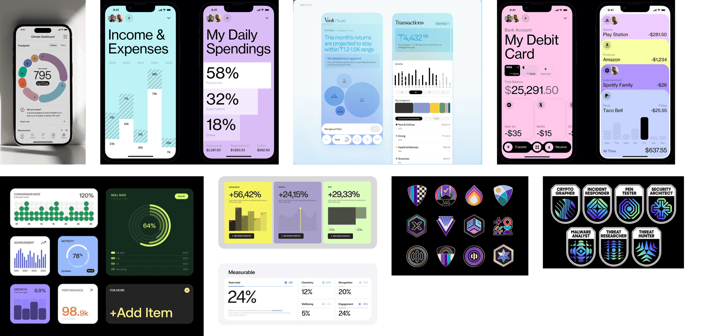
Quantitative research showed people love summaries with context but disengage from complexity. They're motivated by comparisons and nudges — "You vs Nifty50" — and badges with share-ability increase emotional payoff. Qualitative testing surfaced the core insight: users couldn't tell if their portfolio was performing well independently of a rising market. Competitor benchmarking covered INDmoney, Groww, and Paytm Money. Early wireframes tested static summary cards against interactive sliders with real-time projection.
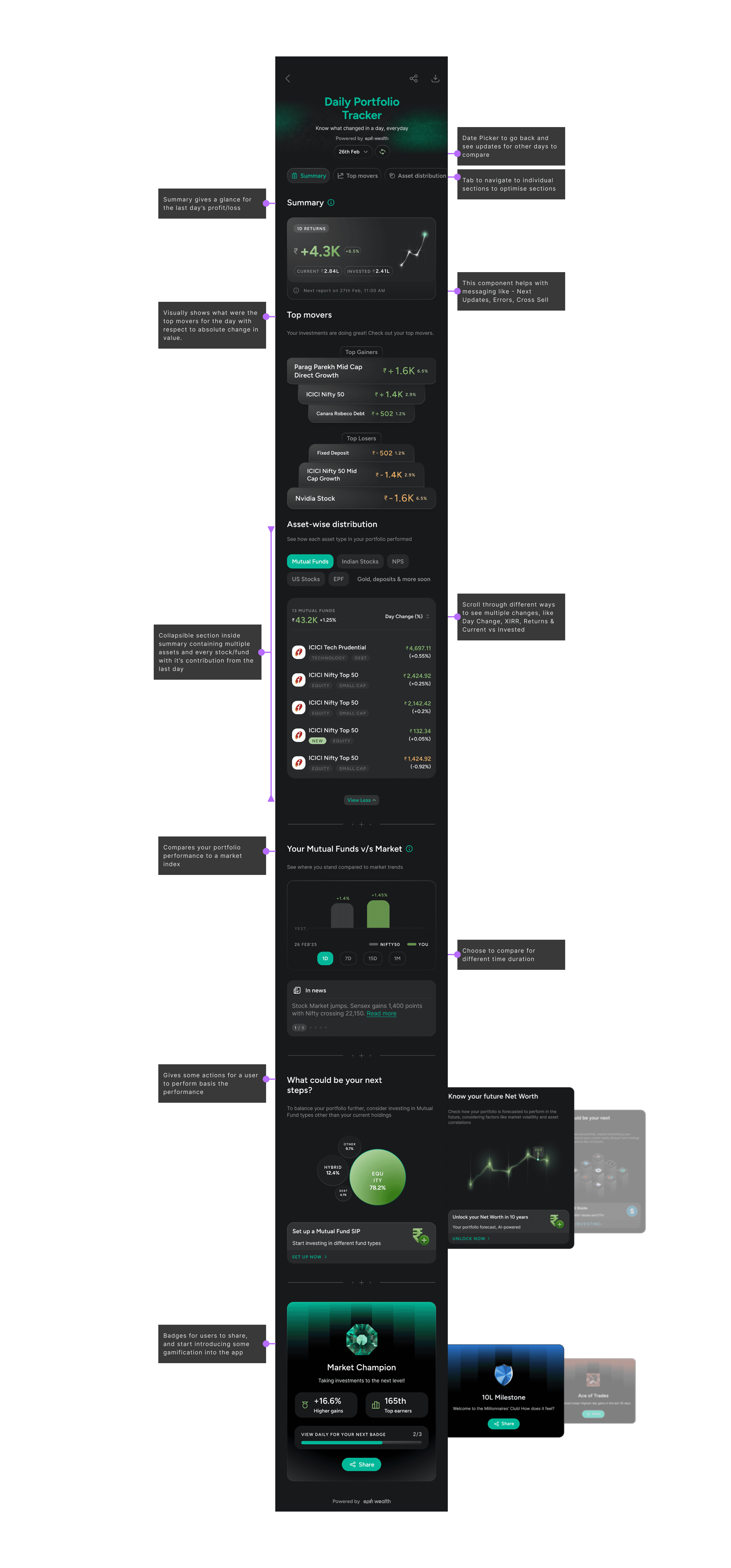
Summary, Movers & Distribution
The Summary section shows the daily return delta (e.g. ₹+4.3K) with a sparkline, an easy toggle between Invested Value and Returns, and an upcoming-report preview. Top Movers breaks down Gainers and Losers as distinct visual cards with brand colours and value deltas. Asset-wise Distribution lets users filter by class (Mutual Funds, NPS, US Stocks, etc.), with expandable per-asset views and day-wise change badges. A date picker lets users go back and compare past days.
You vs Market & Next Steps
"You vs Market" presents a simple dual-bar comparison against Nifty50 — real-world context that builds confidence without complexity. Paired with a curated carousel of market headlines. Next Steps surfaces smart nudges based on the user's portfolio: diversify with US Stocks, explore retirement projections, improve SIP consistency. Cards use an encouraging tone with clear CTAs — making advice feel personal, not generic.
Badges & Gamification
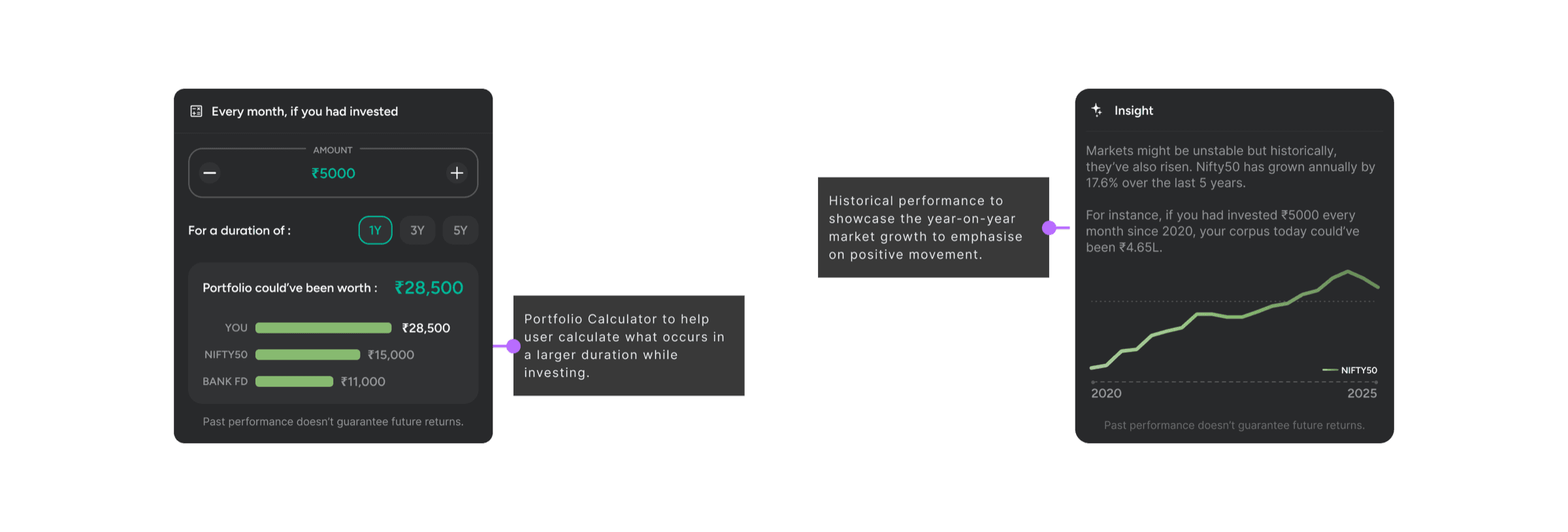
Badges like "Market Champion" (for outperforming Nifty) and "Millionaires' Club" are earned and displayed as shareable visual cards — tapping into virality and positive reinforcement. The system celebrates consistency, diversification, and savings milestones, turning a passive report into an active daily ritual. Historical performance charts and a portfolio calculator round it out for power users who want to project long-term growth.
- — 5x increase in app opens through PNS and comms
- — +15% users landed took action from next steps
- — Positive sentiment from users citing “clarity”, “quick glance”
What Worked
- — People crave clarity and praise in finance — positive framing drives action
- — Daily moments of delight increase product stickiness
- — Smart copy and motion create emotional resonance where data alone doesn't
Challenges
- — Too much data overwhelmed users — collapsible views and simpler language resolved it
- — Generic advice was being ignored — personalised nudges driven by portfolio data fixed this
- — Flat emotional design — badges, comparisons, and celebratory motion added the missing resonance
TIME: