Tiering at Fi
Role
End-to-end Product Designer & Creative Lead
Stakeholders
3 Product Managers, 4 Engineers, 1 UX Writer, 1 Researcher & 1 Analyst
Tools
Figma, Photoshop, Cinema 4D, After Effects & Illustrator

65% improvement in upgrade conversions. Account balances grew by nearly ₹3Cr. Decision-making simplified, and engagement with the membership experience up across the board.
An in-app experience for viewing, comparing, and enrolling in Fi's plans — Prime, Salary Infinite, Plus, Standard, and Regular. Built modularly so new tiers, benefit categories, and entry points slot in without a redesign. The core challenge: make complex choices feel simple, and make progression feel earned.
Problem
Benefits were listed in dense text — users couldn't parse what they'd actually gain by upgrading. "I'm not sure what additional benefits I'd get. The differences feel blurred."
Solution
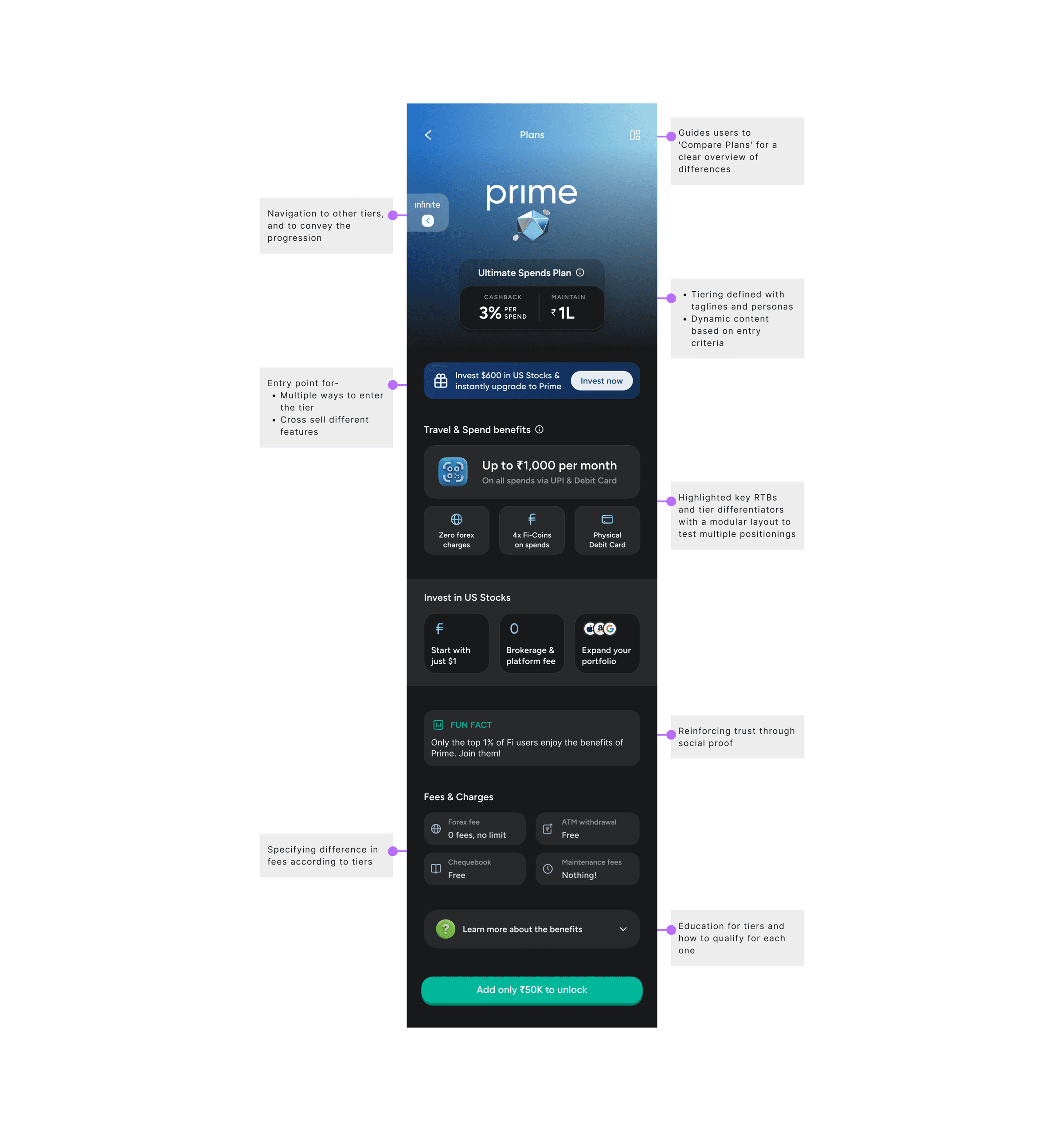
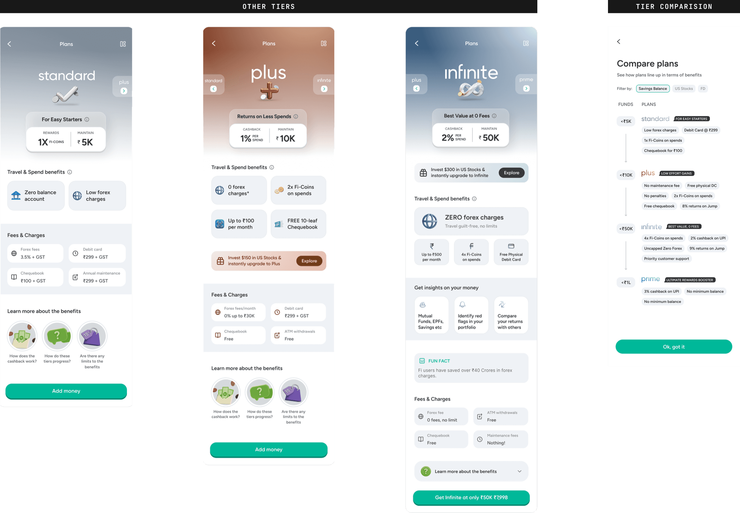
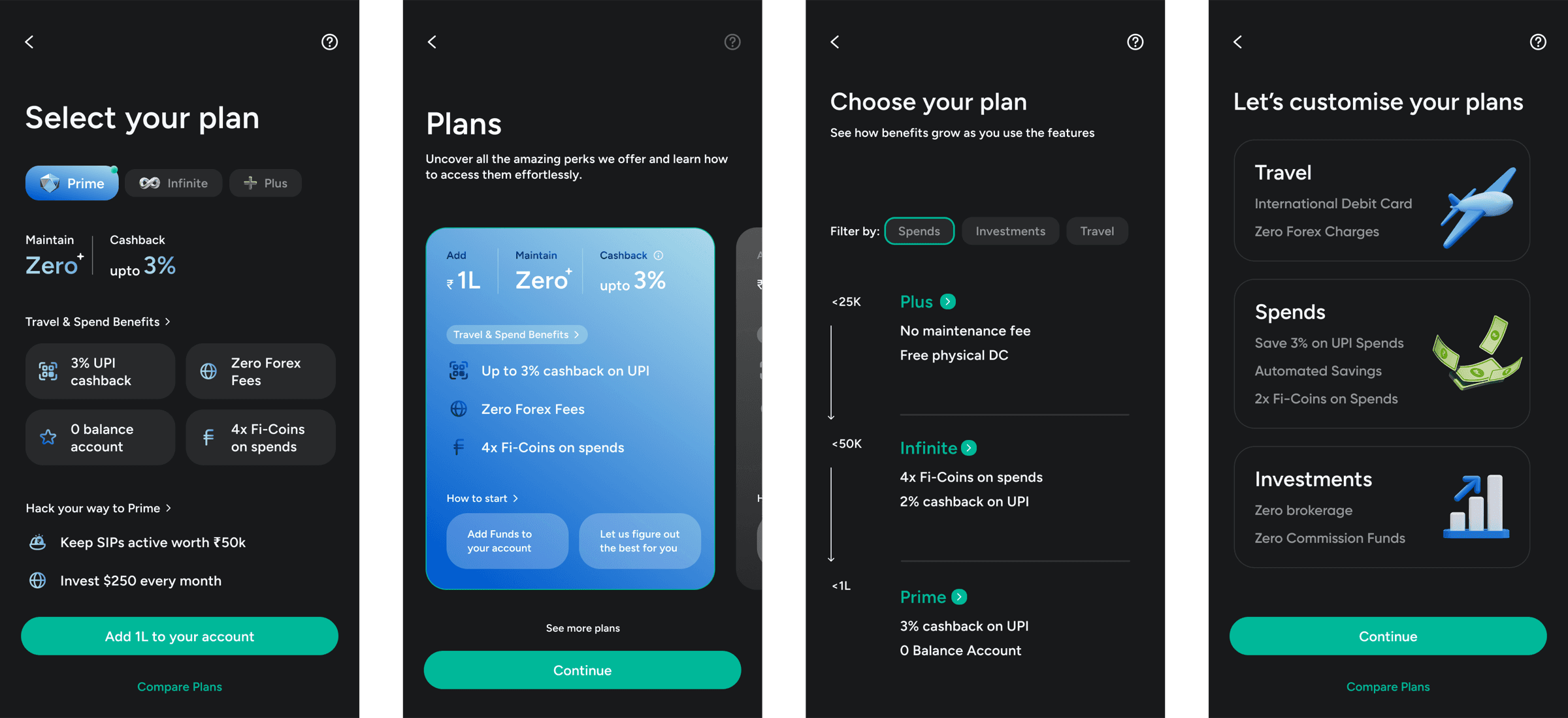
- — Clear comparative visuals that break down benefits tier by tier
- — Modular layout with highlighted key differentiators per tier
- — Taglines and personas per tier to make positioning distinct
Problem
Levelling up felt static — the sense of exclusivity and progression between tiers wasn't communicated at all.
Solution
- — Motion design and micro-interactions to showcase progression
- — Animated progress meter so levelling up feels rewarding
- — Light sweep animations on plan cards to signal interactivity
Problem
Multiple enrollment paths — fixed amounts or investments — confused users trying to understand where they qualified.
Solution
- — Distinct enrollment paths for fixed-amount and investment-based qualification
- — Real-time feedback on progress toward a higher tier
- — Dynamic content based on entry criteria — "Let us figure out the best for you"
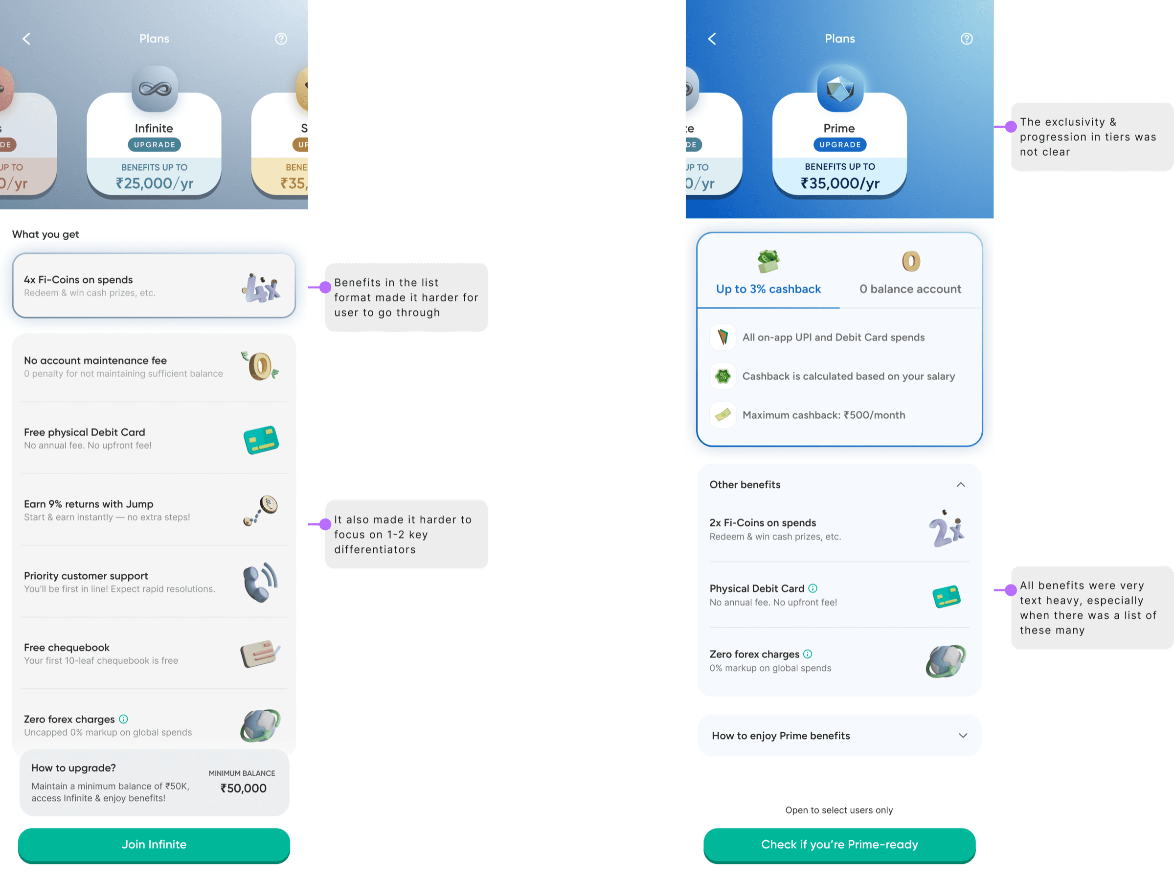
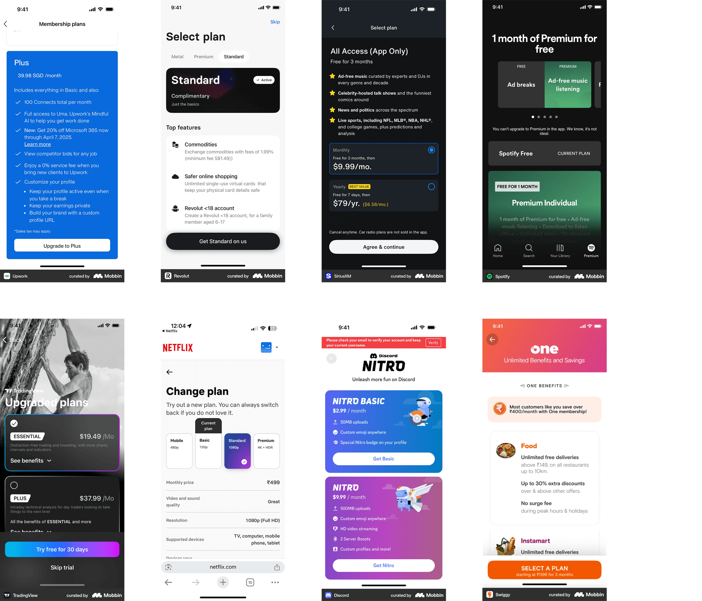
Quantitative research showed users need clear benefit comparisons, visual cues of progression, and multiple entry points based on their financial behaviour. Qualitative testing revealed: "I want to see my progress and what each tier does for my spending style." Competitor benchmarking covered Revolut, Spotify, Tinder, and OTT services — mapping how subscription products communicate value and progression. Wireframe explorations tested static summary cards against interactive sliders with real-time projection.
Information Architecture & Modular Design
The plan overview landing page introduces all tiers as visual cards (Prime, Salary Infinite, Plus, Standard, Regular), with a quick comparison of key benefits and filter options for personalised recommendations. Each plan detail uses expandable sections with modular components that can be rearranged as tiers evolve — education on how to qualify, tier navigation to convey progression, and cross-sell entry points. Clear CTAs at every level reduce drop-off.
Visual & Motion Design
Colour, typography, and iconography signal the difference between plans — Prime is bold and premium, Regular is subdued. Light sweep animations on plan cards emphasise interactivity and clarify benefits on tap. Celebratory animations play when a user progresses between tiers. The animated progress meter visually shows advancement, milestone rewards reinforce positive behaviour, and upgrade nudges surface contextually through multiple touchpoints.
More changes:
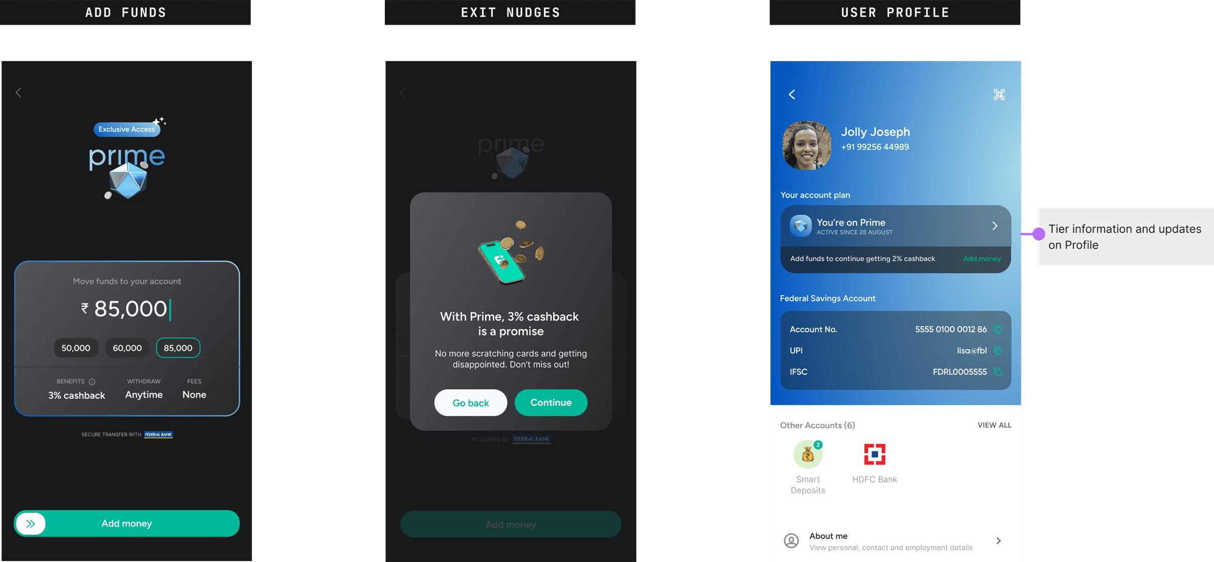
- — ~65% increase in people choosing to upgrade (including journey improvements)
- — 4% increase in Prime tier upgrades
- — ~3cr increase in account balances
What Worked
- — Visual storytelling transformed a static membership experience into an engaging progression journey
- — Modular design ensured longevity — easy to reorder, recategorise, and extend as tiers evolved
- — Micro-interactions and clear progression cues built user confidence — "I love the animated progress meter — it makes levelling up feel rewarding!"
- — Clear visual progress and immediate feedback reduced cognitive load
Challenges
- — Dense benefit lists created visual clutter — replaced with modular cards surfacing 1–2 key differentiators per tier
- — Unclear value made users hesitant to upgrade — fixed with action-oriented copy and live progress indicators
- — Future-proofing — built a scalable framework that adapts to new tiers and benefit categories without a redesign
TIME: