Wealth Dashboard
Role
End-to-end Product Designer & Creative Lead
Stakeholders
2 Product Managers, 8 Engineers, 1 UX Writer, 1 Researcher & 1 Analyst
Tools
Figma, Photoshop, After Effects & Illustrator, Lottie
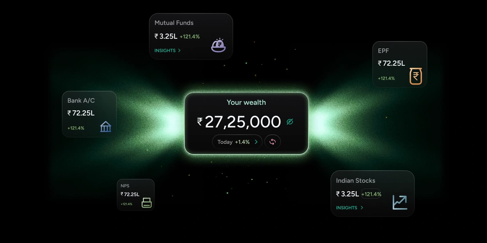
25% increase in refresh interactions. More assets connected, fewer drop-offs, and a clear jump in time spent on the dashboard.
A net worth dashboard that consolidates mutual funds, stocks, bank accounts, EPF, NPS — and more — in one view. It updates in real time with daily market movements, uses subtle motion to signal change, and gives users a genuine sense of ownership over their financial progress.
Problem
Users managed investments across 4–5 apps — no single place gave them a reliable, up-to-date picture of where they stood.
Solution
- — A consolidated asset grid with a real-time total wealth header, privacy toggle, and manual refresh — making Fi the default destination for wealth monitoring.
Problem
Users had no way to know what changed in their portfolio day to day — leading to anxiety and passive disengagement.
Solution
- — Color-coded value deltas, shimmer animations on updated cards, and a count-up/down animation for refreshed net worth values.
Problem
Displaying too much data at once risked overwhelming new users and creating visual noise.
Solution
- — Progressive disclosure — simple overview first, with 'Insights' CTAs per asset to expand detail. Muted backgrounds with focused color only on deltas.

Quantitative analysis showed most users didn't explore long-term planning features and had low engagement with individual asset updates. Qualitative interviews surfaced: "I wish I didn't have to open 5 apps to see how my net worth is doing" and "Sometimes I'm not sure what changed today in my portfolio." Competitor benchmarking (INDmoney, Groww, Revolut, Dezerv) revealed a gap: users want clarity on daily changes with simple mental models, and value motion that feels reassuring and human.
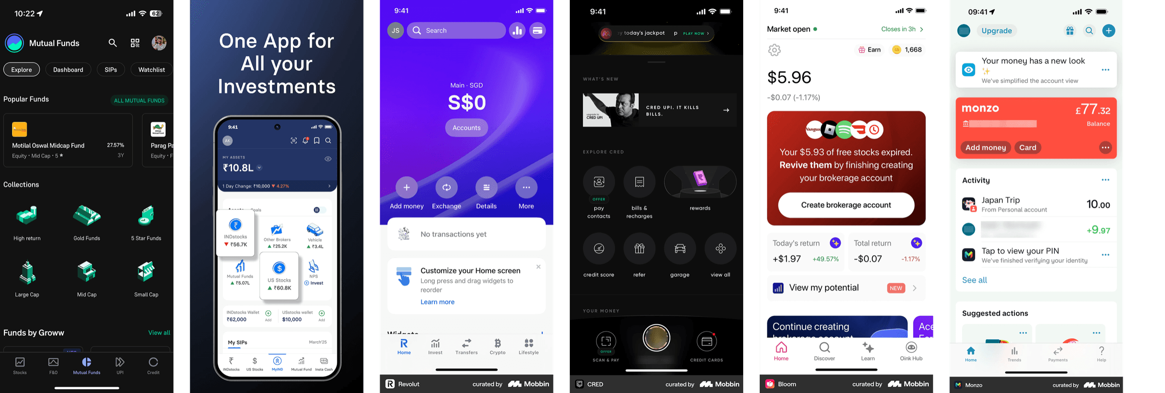
Four goals drove the UX strategy: unified overview of wealth (asset cards + total wealth header), clear changes and growth (animations + highlights for updated values), delight through motion (micro-interactions showing wealth change), and transparency (manual refresh + update feedback). Information architecture: Total Wealth Summary → real-time change indicator → asset grid (Mutual Funds, Indian Stocks, Bank A/C, NPS, EPF) → per-asset Insights CTA.
Four goals drove the UX strategy:
- — Unified overview of wealth (asset cards + total wealth header)
- — Clear changes and growth (animations + highlights for updated values)
- — Delight through motion (micro-interactions showing wealth change)
- — Transparency (manual refresh + update feedback)
Information architecture:
Total Wealth Summary → real-time change indicator → asset grid (Mutual Funds, Indian Stocks, Bank A/C, NPS, EPF) → per-asset Insights CTA.
Interaction & Motion Design
Key interactions: manual refresh for user control, change animations when data updates (asset cards animate in), color-coded value deltas (e.g. +121.4% in green), and a net worth visibility toggle for privacy. Micro-animations: net worth counts up or down to the refreshed value, asset cards shimmer while updating, trust markers surface at the top of the stack.
Visual Design:
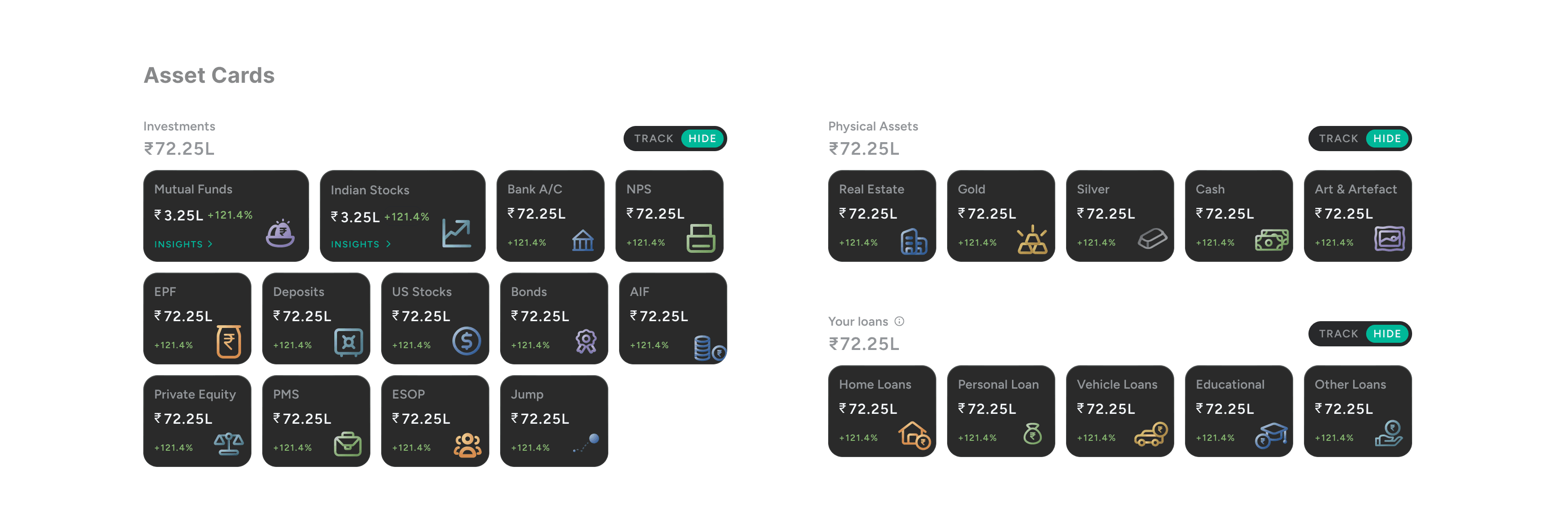
Dark theme for focused viewing and a premium feel. Distinct icons build visual cues for each asset class. Gradients and depth differentiate categories. Accessibility: generous tap targets, legible type, strong contrast. Muted backgrounds keep visual noise low while focused colour draws attention to what changed.
- — ~25% increase in refresh interactions/week
- — 30 boosted dashboard engagement for new users
- — +5% increase in total assets linked for users interacting with Dashboard
- — ~8% increase in discovery for assets like EPF, Physical Assets & Loans
What Worked
- — Letting users control which assets surface first gave a sense of ownership
- — Designing for trust is more about accuracy and language than decoration
- — Micro-interactions can dramatically shape the emotional tone of financial products
Challenges
- — Data sync delays — resolved with a spinner, shimmer, and a tooltip explaining the wait
- — Risk of overwhelming new users — resolved with progressive disclosure: overview first, depth on demand
- — Visual overload — kept noise low with muted backgrounds; color used only to signal change
TIME: