Fi Onboarding
Role
End-to-end Product Designer & Creative Lead
Stakeholders
3 Product Managers, 6 Engineers, 1 UX Writer, 1 Researcher & 1 Analyst
Tools
Figma, Photoshop, Cinema 4D, After Effects & Illustrator
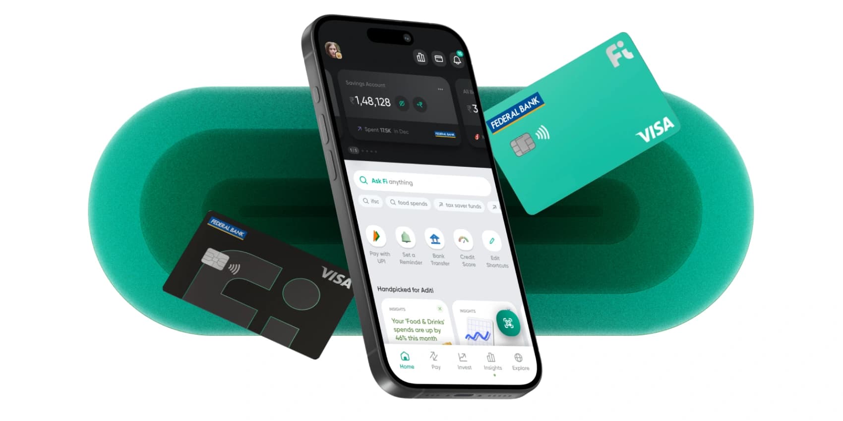
Onboarding improvements led to a ~10% increase in users reaching the main product, while reducing average completion time by ~15%.
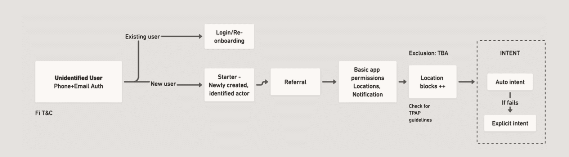
This project is the outcome of nearly two years of continuous iterations, improvements, and new feature development. It focuses on the Onboarding experience, which is responsible for shaping how users begin their journey on Fi, discover features, and build trust in the product. The scope covers the entire journey—from splash screen to VKYC. While onboarding is broad, this case highlights key interventions designed to make the experience more seamless, intuitive, and user-centred.
Problem
Too many features upfront — users with clear intent still dropped off because the flow felt overwhelming.
Solution
- — Personalise journeys based on declared intent
- — Cleaner copy and more focused visuals
- — Surface product value progressively, not all at once
Problem
As a new fintech product, credibility had to be earned early — users were cautious about sharing personal and financial data.
Solution
- — Visuals that felt familiar, not foreign
- — Social proof at friction points
- — Surface security and privacy signals early
Problem
Regulatory compliance meant long, mandatory forms — users dropped off before completing the account opening process.
Solution
- — Consolidate multi-step flows wherever possible
- — Auto-fetch and pre-fill details users had already provided
- — Contextual helpers for unfamiliar or compliance-heavy steps
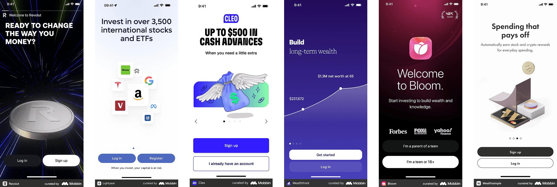
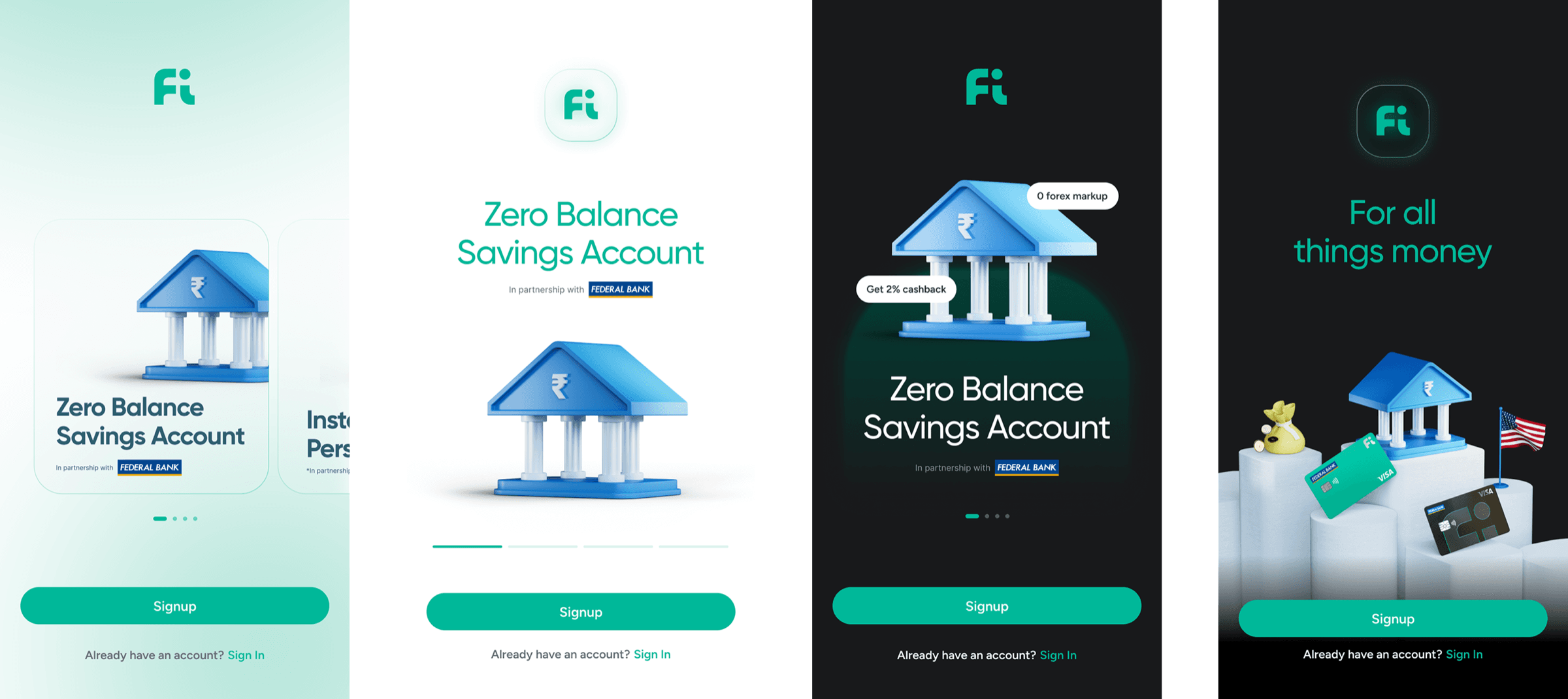
Only 71% of users moved past the landing screen. The existing design was dated, lacked trust signals, and gave no real sense of what Fi offered. The redesign sharpened information hierarchy, added partner logos and social proof, and introduced intent-based personalisation — surfacing the right features for users arriving from performance marketing.
Observations-
- — Lack of context about the app and its key features.
- — Limited trust signals or recognisable partnerships, leading to hesitation.
- — A segment of users dropped off but returned later, indicating uncertainty rather than disinterest.
- — The screen was not tailored to performance-marketing-driven traffic, which often arrives with specific intent.
- — Static, disconnected visuals failed to engage or resonate with the user.
Design Solutions
- — Improved information hierarchy and interaction design to make navigation intuitive and progression effortless.
- — Trust-building elements like recognisable logos, and social proof to create reassurance.
- — Personalisation based on user intent—highlighting relevant features or products to align with what brought them in.
- — A visual refresh that brought warmth, energy, and relatability to the screen.
Other Explorations
As part of the bank account opening flow, this screen collected the user’s PAN (Permanent Account Number) and Date of Birth—a mandatory compliance step. However, it also emerged as the most friction-heavy point in the onboarding journey, contributing to a ~40% drop-off at this step.
Observations & Hypotheses - A mix of trust, memory recall, and technical issues were found to be major contributors to the drop-off:
- — Trust deficit: Users were hesitant to share sensitive information like PAN unless they felt assured of the app’s legitimacy.
- — Information unavailability: Some users didn’t have their PAN details handy or couldn’t recall the number.
- — Verification failures: In cases where PAN was linked to a different mobile number, users were confused by rejections or verification errors.
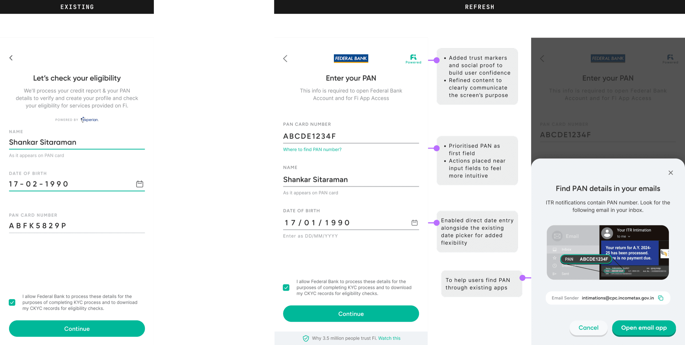
Design Solutions - To reduce friction and boost user confidence, the following design interventions were introduced:
- — To reduce friction and boost user confidence, the following design interventions were introduced:
- — Trust-building elements: Included trusted brand logos, badges, and social proof cues to reinforce credibility and security around data collection.
- — Assistive UI elements: Added smart hints and helper text guiding users on how and where to locate their PAN (e.g., SMS, e-mail, tax documents).
- — Error messaging refinement: Improved clarity around why a verification might fail and what steps the user can take—helping reduce confusion and abandonment.
Results
The redesign added trust markers (brand logos, social proof badges), smart hints for locating PAN via email or SMS, and honest error messages for failed verifications. 14% of users who tapped the hint completed via email.
The live video verification call is a critical trust moment — but users arrived unprepared. The UI didn't explain what the call would involve, documents weren't flagged in advance, and users had to re-enter details they'd already submitted. The redesign added a structured pre-call briefing (checklist, time estimate, step-by-step walkthrough), an editable review of prior details, and microcopy that felt reassuring rather than procedural.
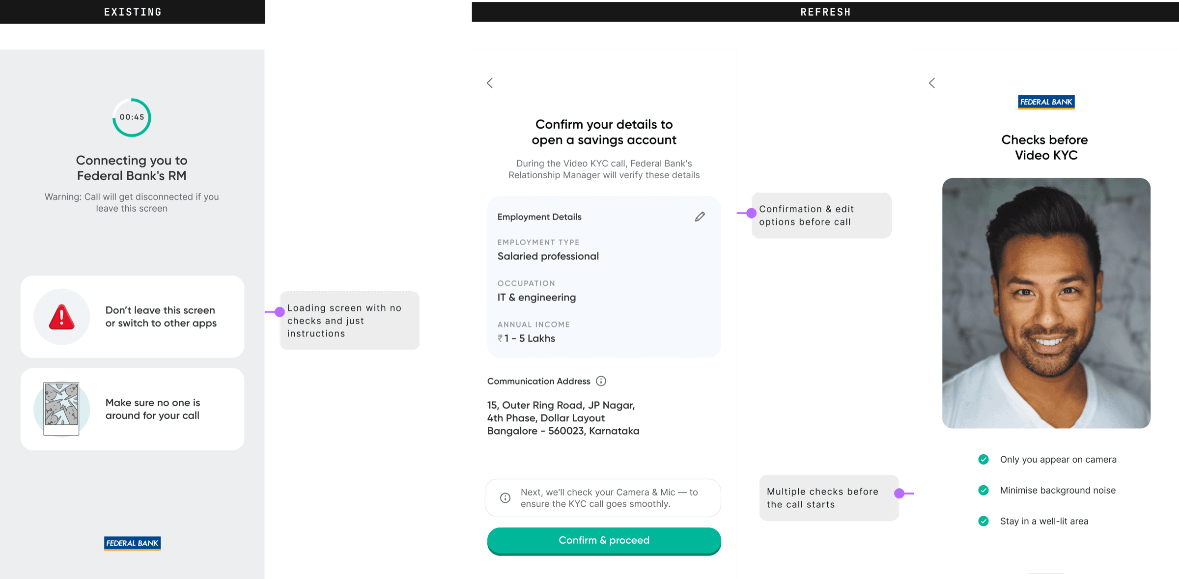
Design Solutions
- — Pre-call overview: Added a clear, structured preview of what the call would involve, including documentation, verification steps, and time expectations—helping users feel informed and in control.
- — Editable verification summary: Introduced a review-and-edit step where users can view and confirm key details they had submitted earlier—reducing friction during the live interaction and preventing user error.
- — Tone & language refinement: Adjusted the microcopy to feel more reassuring and human, reinforcing trust and confidence during this pivotal moment.
Results
- — +8% successful calls with data confirmed by user
- — -24% users getting rejected for audio/visual issues
- — -15% decrease in CX outcalls
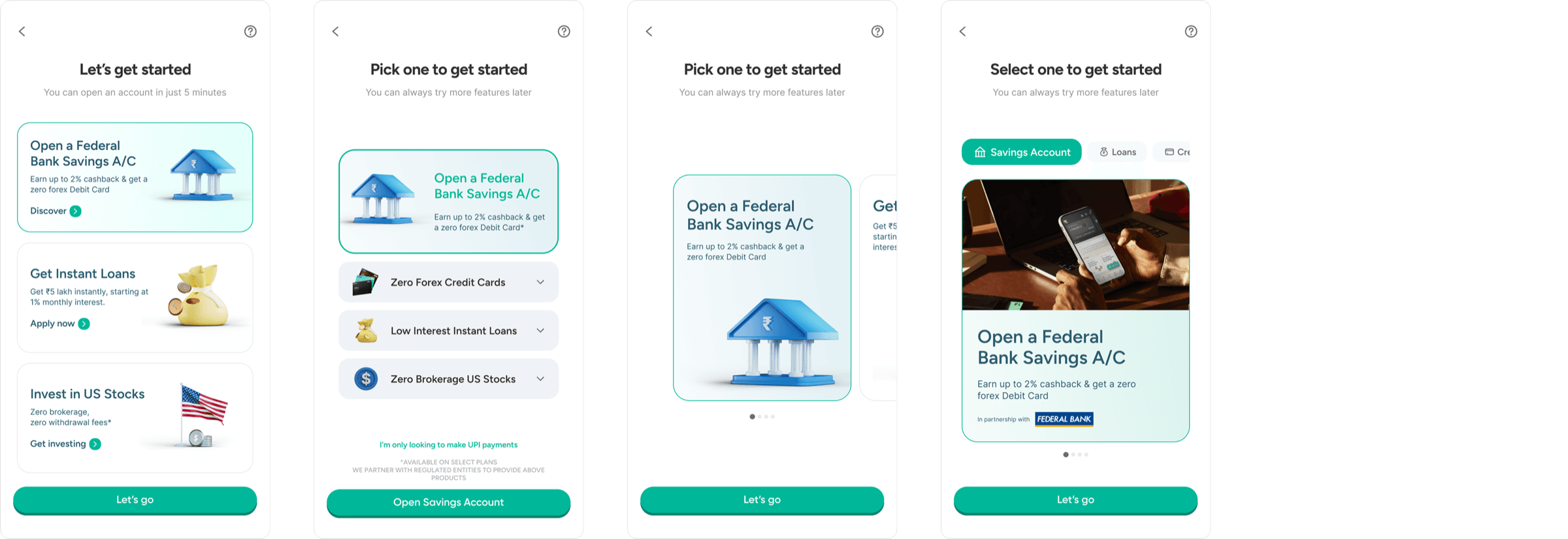
Where users pick their path — Savings Account, Loans, Credit Cards, or US Stocks. The old layout was dense: too many components, generic icons, copy that described features instead of benefits. The redesign cut through: single-line copy, reduced density, emotionally engaging visuals, and messaging that led with what users gain.
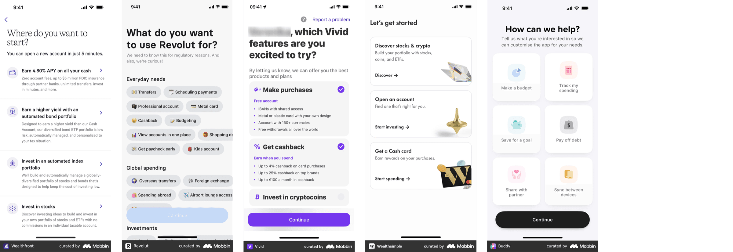
Observations & Hypotheses - While the screen showed minimal drop-off, its role was more than just transitional—it needed to educate, engage, and differentiate. Key insights included:
- — Lack of clarity for new users: First-time users unfamiliar with Fi struggled to grasp its unique value proposition.
- — Visually overwhelming: A dense layout with too many components and blocks of information made the UI feel clunky and hard to scan. Basic visuals: The icons and imagery used lacked personality and failed to create emotional resonance.
- — Unclear copy: Feature descriptions didn’t clearly communicate what the user stands to gain or the actions the feature resulted to.
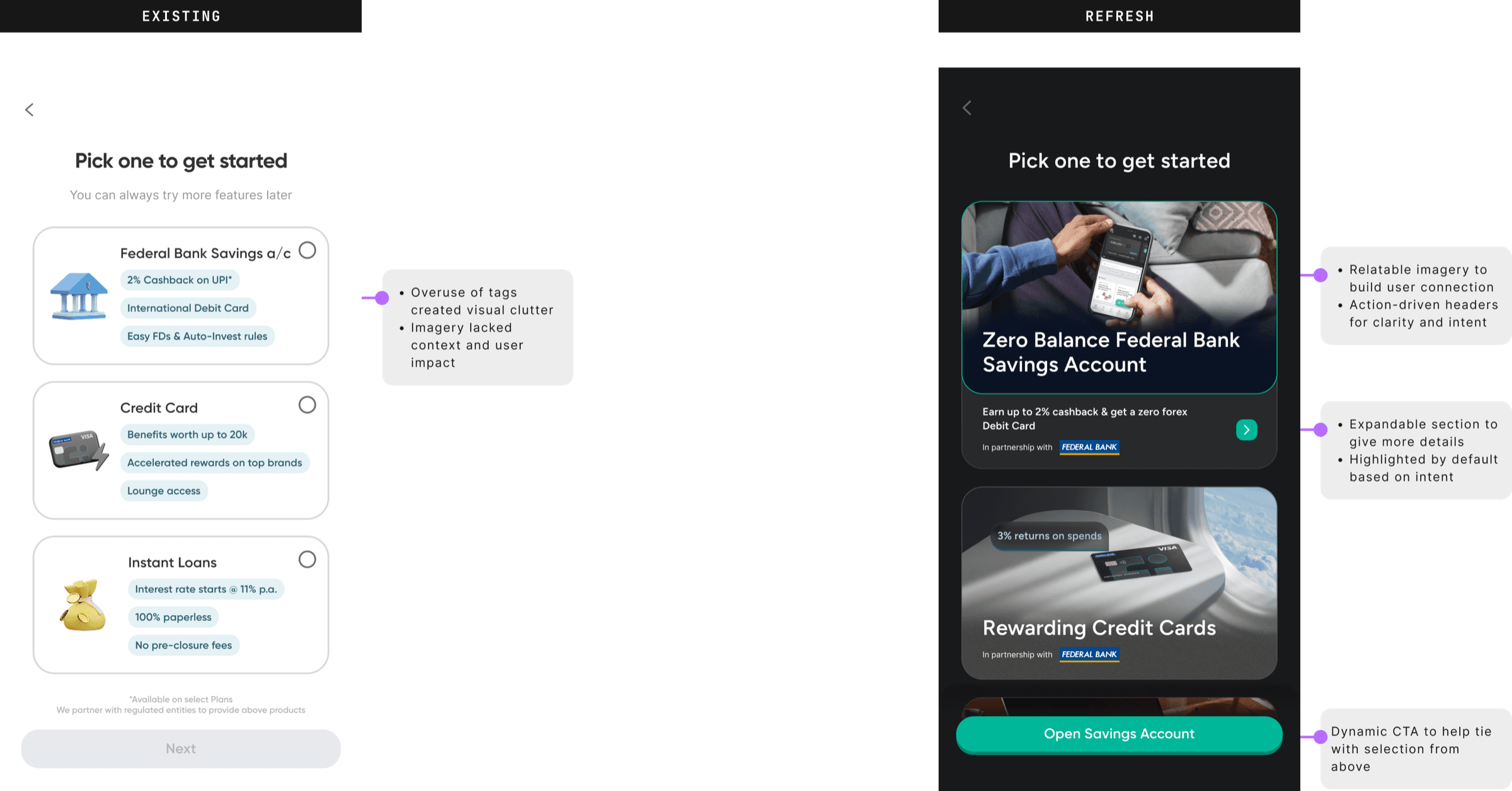
Design Solutions- To make the screen more purposeful and user-friendly, the following improvements were implemented:
- — Simplified content delivery: Replaced tag-heavy, list-based descriptions with concise, one-liner copy to improve readability.
- — Cognitive ease through layout: Reduced component density and structured information into digestible chunks for better visual hierarchy.
- — Human-centred visuals: Introduced more expressive, emotionally engaging imagery that evokes curiosity and relatability.
- — Action-oriented messaging: Shifted from descriptive to benefit-driven, interactive copy that nudges users to take the next step.
Other Explorations
What Worked
- — Small copy and layout changes had outsized impact on clarity
- — Light personalisation early in the journey reduced confusion and increased trust across multiple screens
- — Contextual helpers and tooltips drove bigger gains than full redesigns
- — Shaved ~15% off average onboarding time
Challenges
- — Balancing depth of guidance with flow simplicity
- — Design ops at scale — managing a 500+ screen modular system across multiple user flows with tight update cycles
- — Regulatory constraints left little room for simplification — every screen had to be detailed and compliant
TIME: